
BRANDING / LOGISTICS
HM Supply Chain Solutions
HM Supply Chain Solutions is about bringing the world a little closer together. They are basically into the business of Logistics/ C&F(Carrying & Forwarding Agents) where they provide quality services to our principals like warehousing, helping them in distributing the stocks, transportation, inventory management, account keeping and all other related compliances.
CLIENT
HM Supply Chain Solutions
HM Supply Chain Solutions
SERVICE
Brand Identity Design
Brand Identity Design
INDUSTRY
Logistics
Logistics

CHALLENGE
H&M Logistics required a professional brand identity that would reflect the scale, reliability, and operational excellence of their business. Working with leading FMCG and pharmaceutical companies, the brand needed to communicate trust, security, and professionalism across every touchpoint.
The challenge was to create a logo system that visually represented the company’s commitment to safe and secure cargo transportation while instilling confidence in clients that their logistics operations were being managed with precision, responsibility, and care.
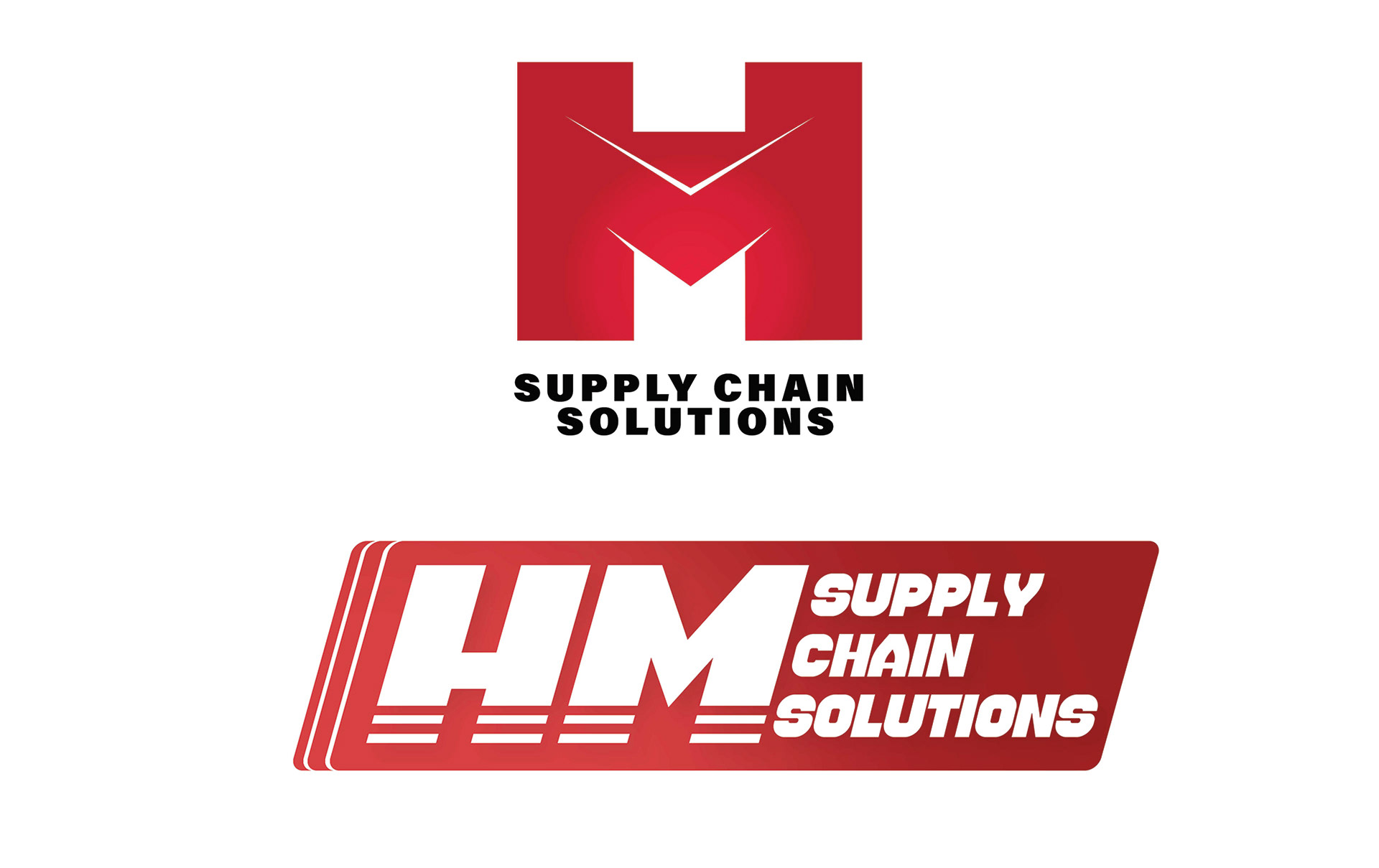
EARLY CONCEPTS
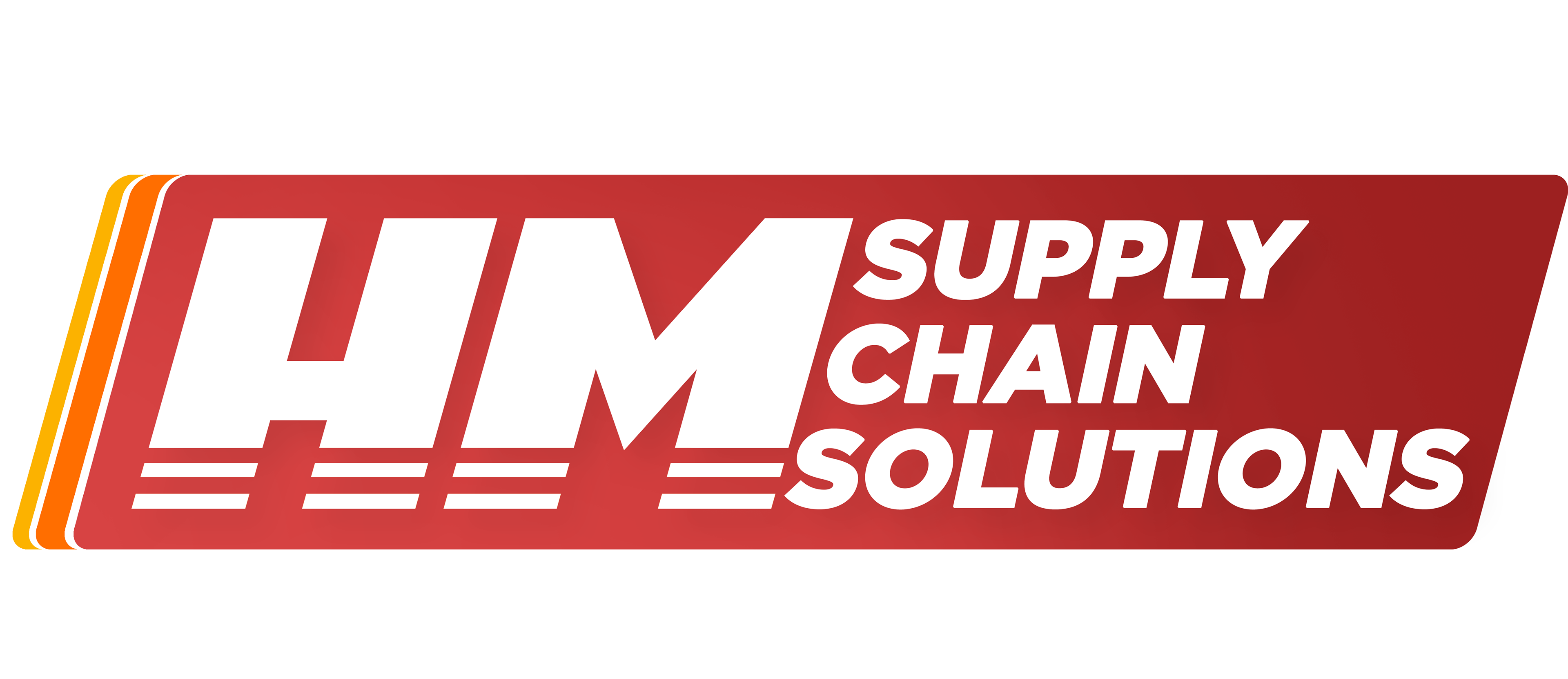
FINAL BRAND MARK

OUTCOME
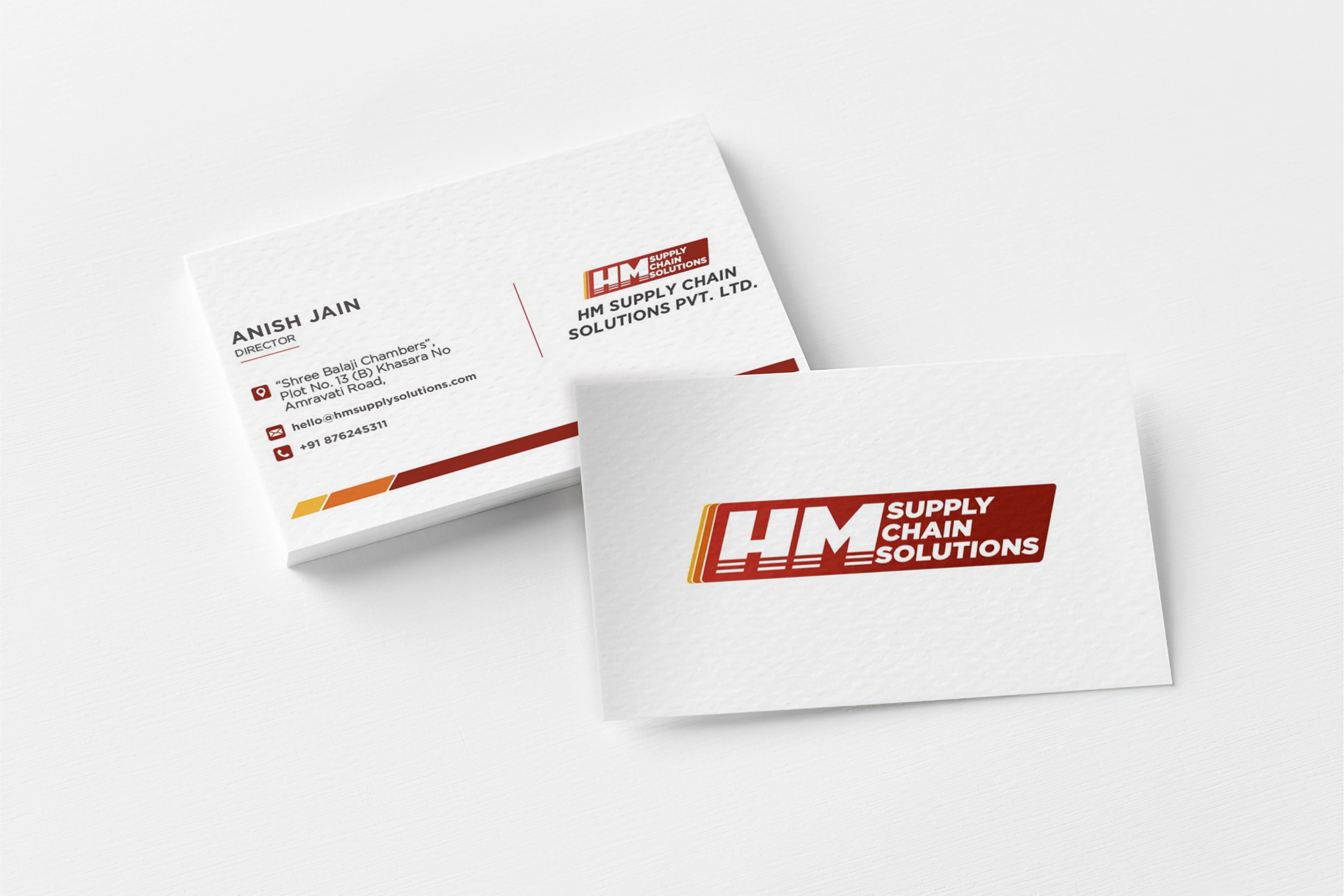
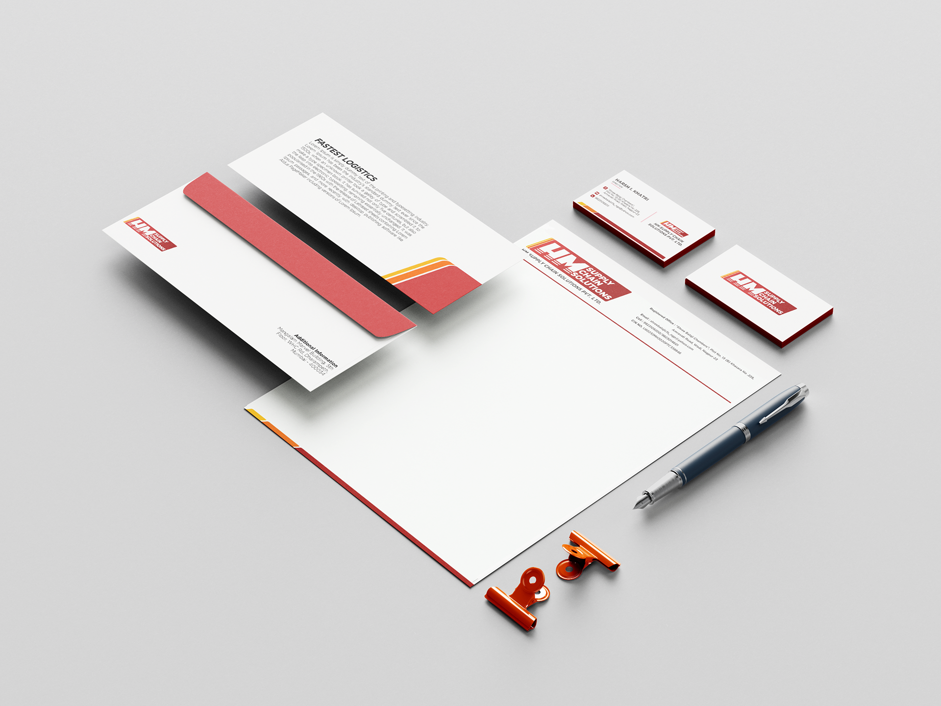
Once the identity system was established, we extended the brand across a range of professional collateral to create a cohesive and recognizable visual presence. The branding was strategically applied across business cards, envelopes, and letterheads, ensuring consistency throughout every client-facing touchpoint.
The logo design was inspired by the form of a shipping box, combining the initials “H” and “M” into a compact and structured mark. Warm gradient tones were introduced to symbolize speed, energy, and operational efficiency, while the balanced geometric composition conveyed trust, stability, and reliability.
CONCLUSION
The final identity system positioned H&M Logistics as a modern, reliable, and professional logistics brand capable of serving large-scale FMCG and pharmaceutical clients with confidence. Through strategic branding and cohesive visual design, we created a scalable identity that communicated trust, speed, and operational excellence across every touchpoint.
For collaborations and project inquiries:
hello@theflostudio.com
hello@theflostudio.com