BRAND IDENTITY DESIGN
Studio Unwind Brand Identity Design
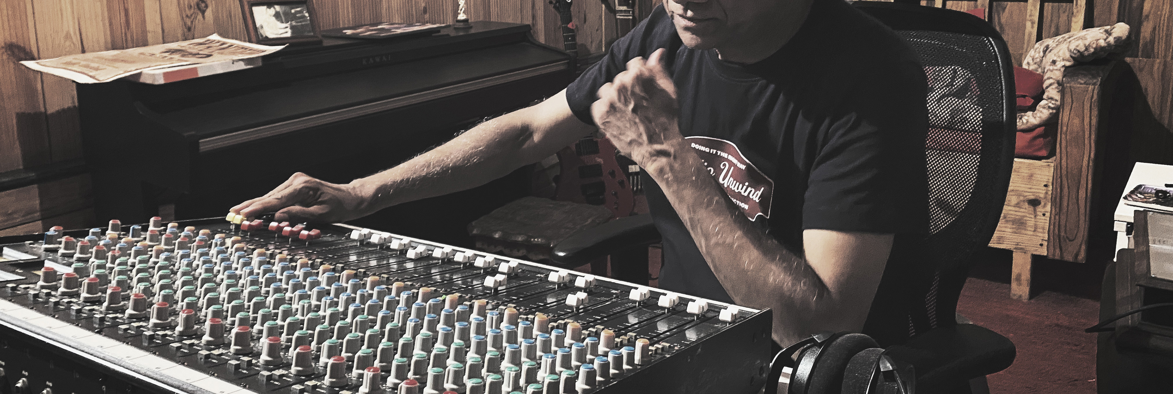
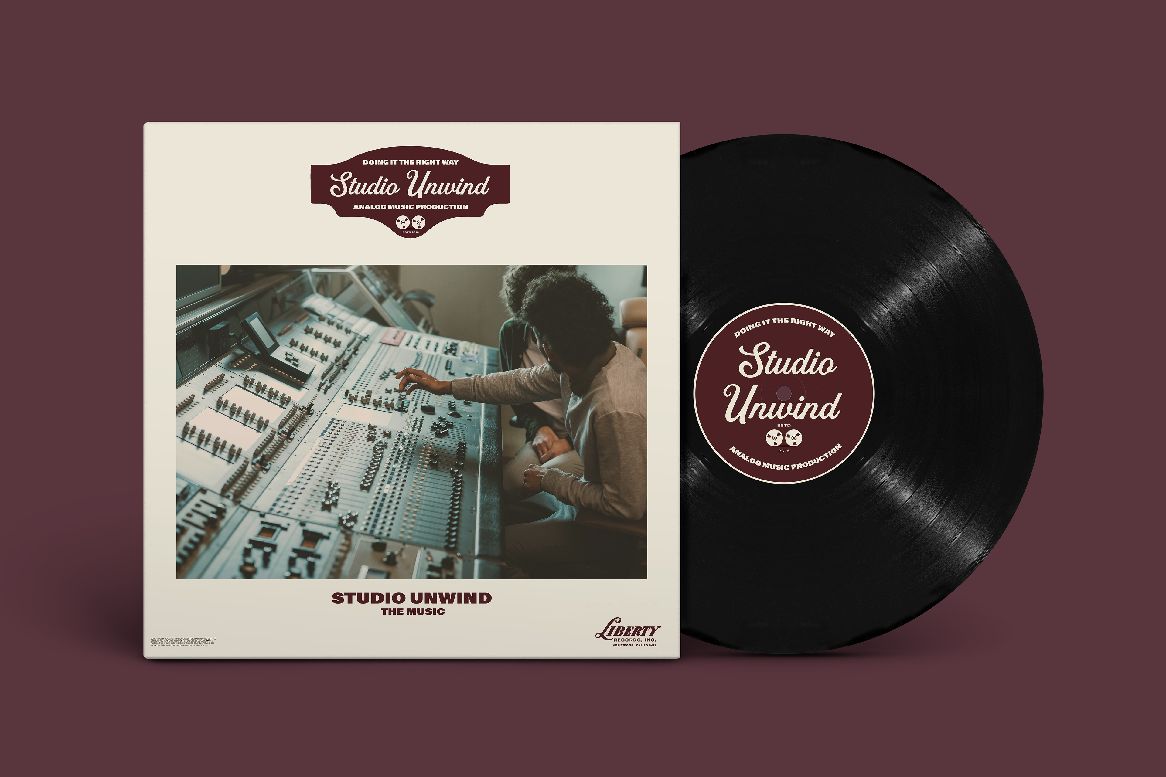
Studio Unwind is an analog-first music studio committed to preserving the authenticity and soul of music.
We were brought in to reimagine their identity from the ground up — creating a brand that not only speaks to musicians but becomes a symbol of timeless creativity. Studio Unwind stands for sonic purity.
CLIENT
Studio Unwind
Studio Unwind
SERVICES
Branding / Website Design
Branding / Website Design
INDUSTRY
Music Production Studio
Music Production Studio

CHALLENGE
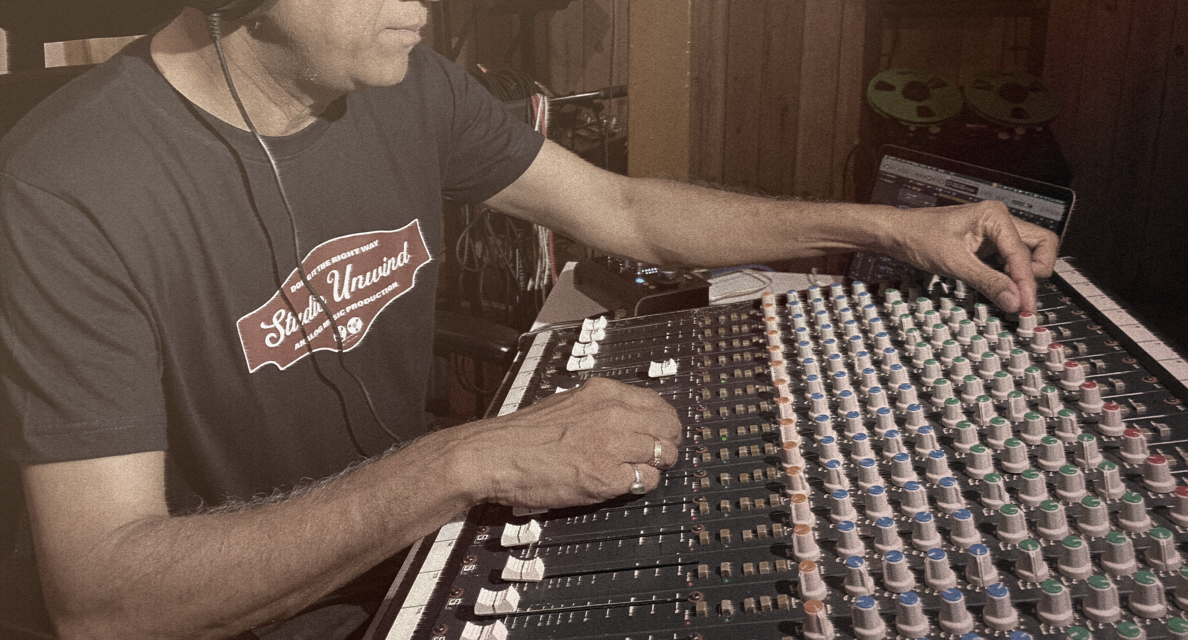
Studio Unwind lacked a distinct visual identity and a memorable logo that reflected its unique positioning as an analog music studio. Without a clear brand mark, the studio struggled to build recognition, create consistency across touchpoints, and connect emotionally with its audience. They record, mix, and master music using analog hardware, offering a soulful alternative in a world of digital shortcuts
OUR SOLUTION
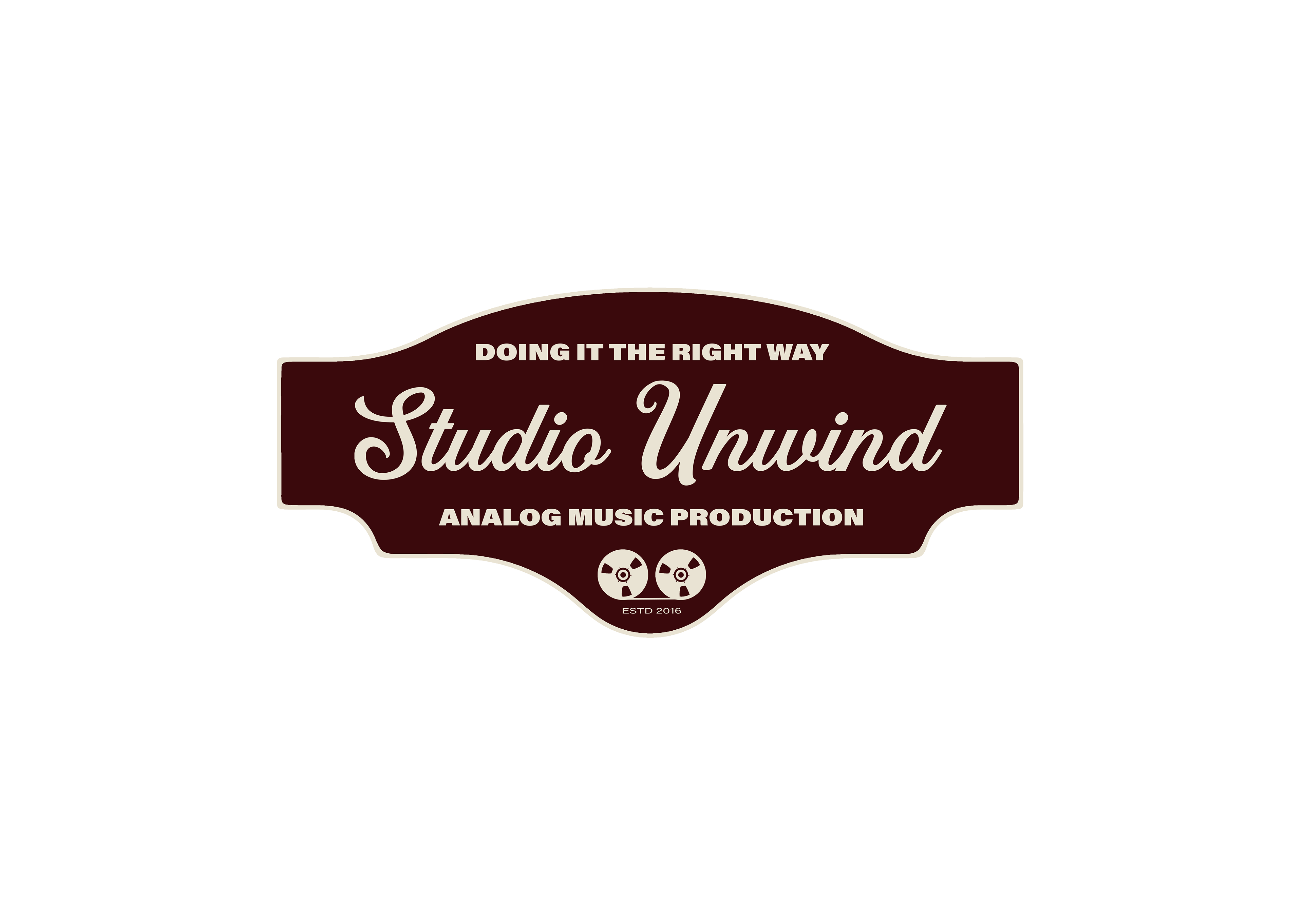
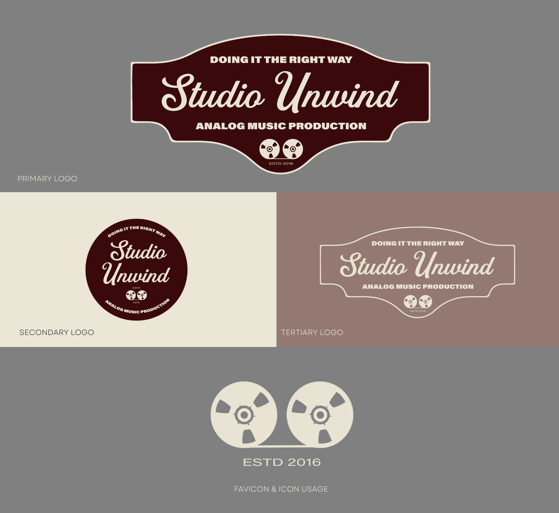
We began by diving deep into the essence of Studio Unwind—its passion for authentic, analog sound and its commitment to creating soulful music experiences. From this foundation, we crafted a minimal yet powerful logo that captures the studio’s analog roots and artistic spirit.
What We Did
- Vision Boards
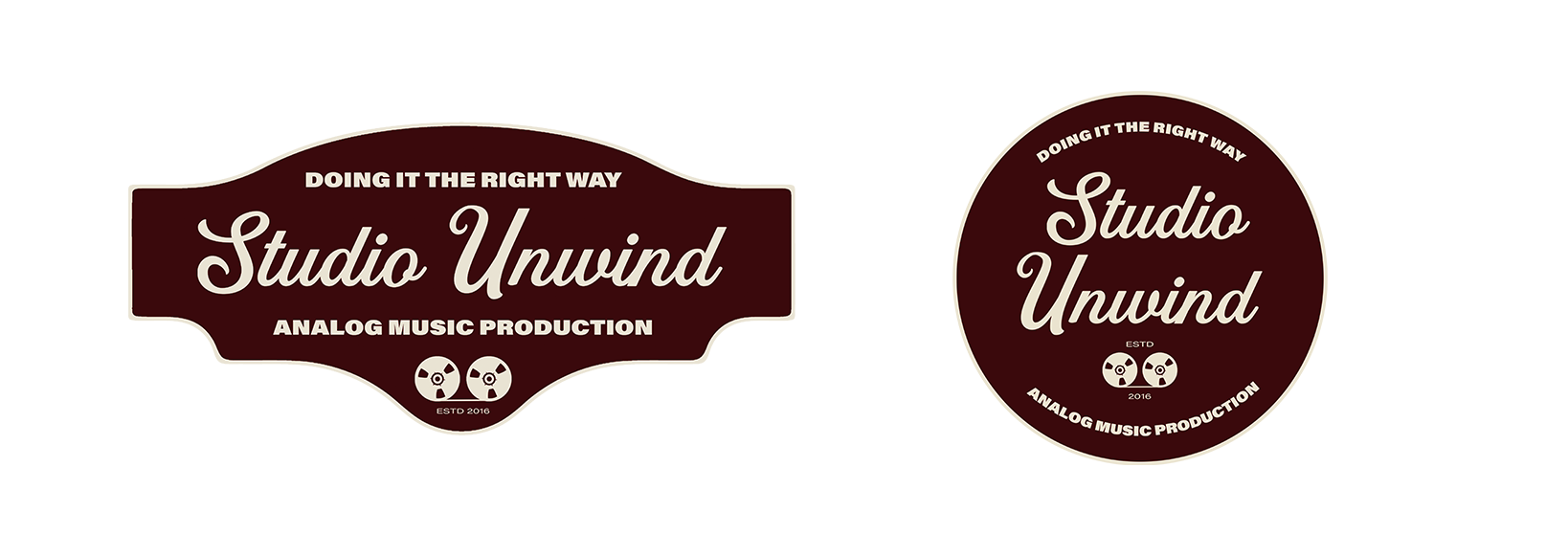
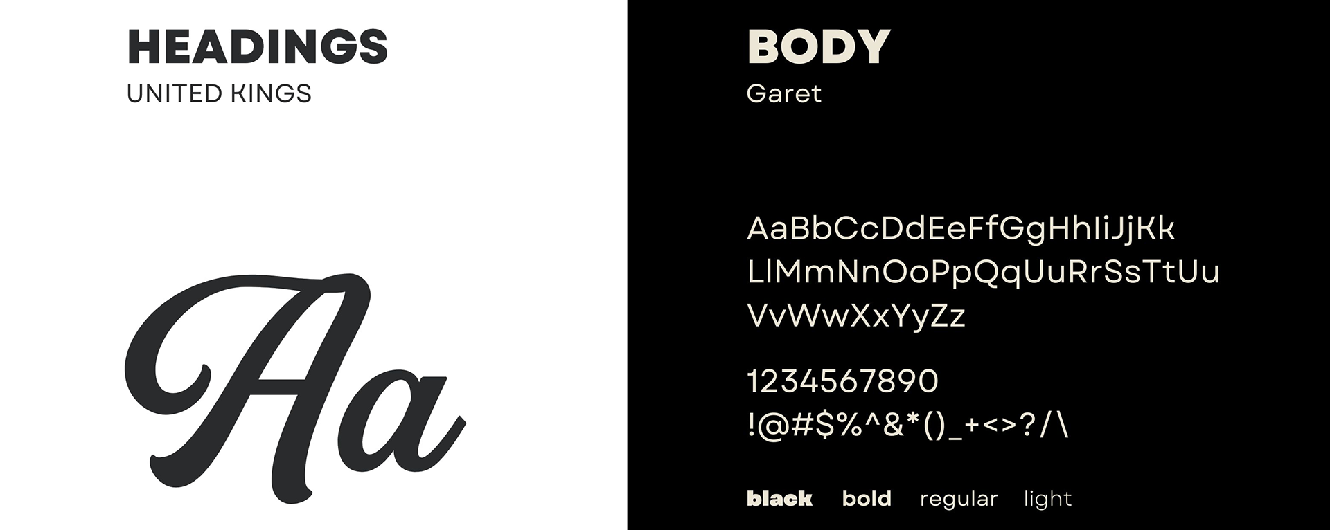
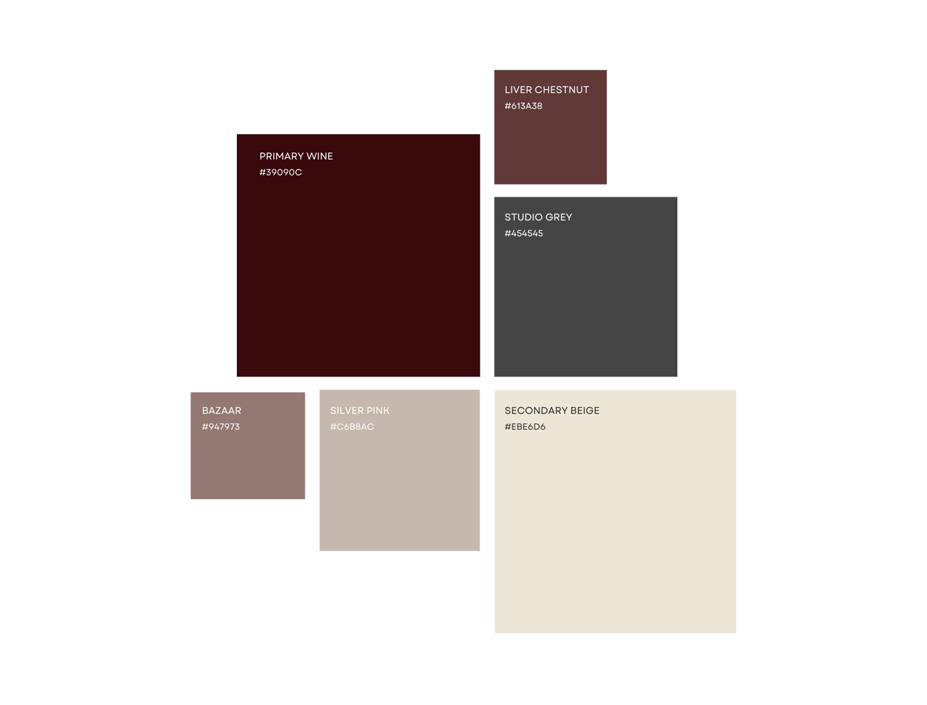
- Logo System
- Type, Color, Grid System
- Art Direction
- Digital Brand Guidelines
- Print Design & Assistance
- Logo Animation
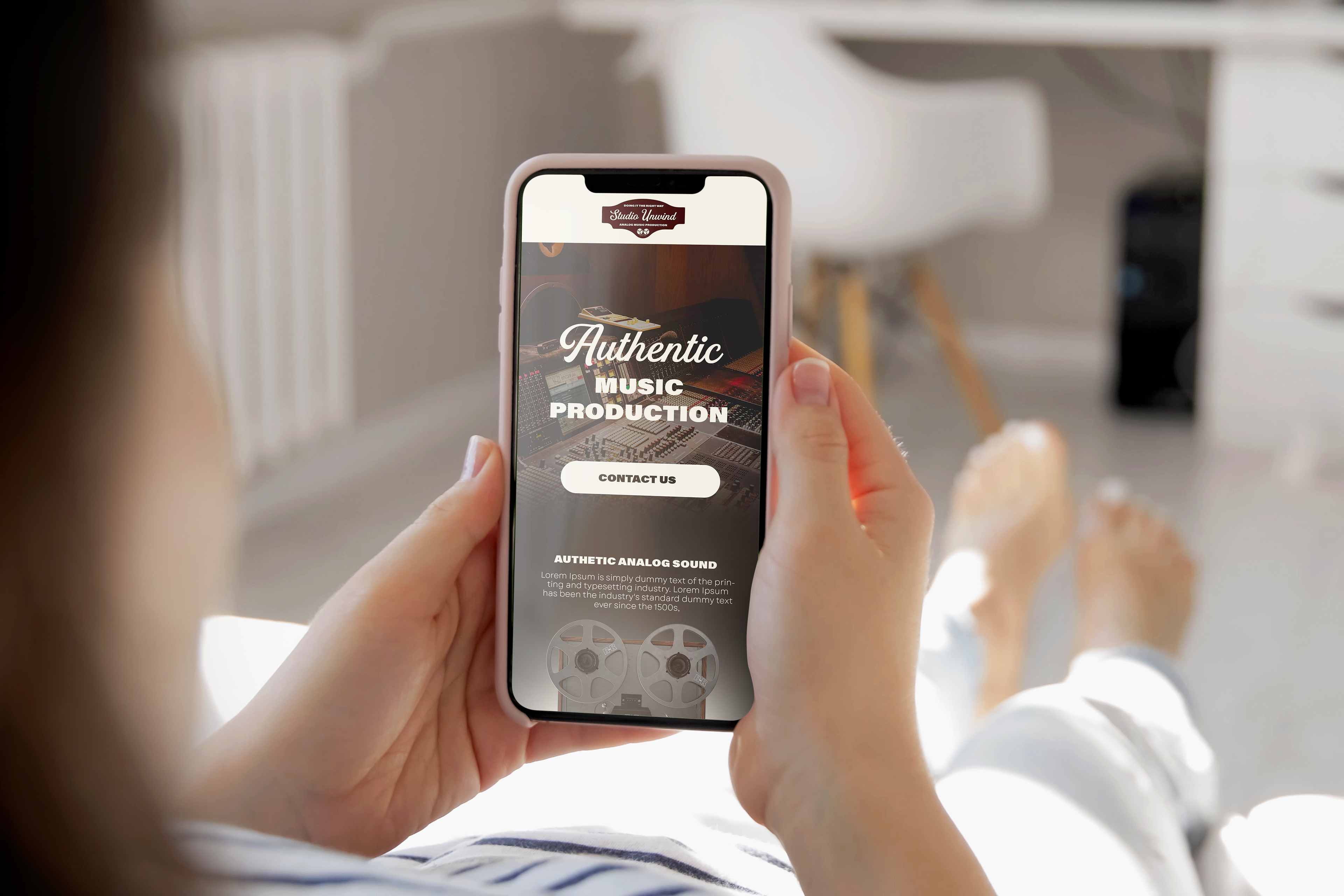
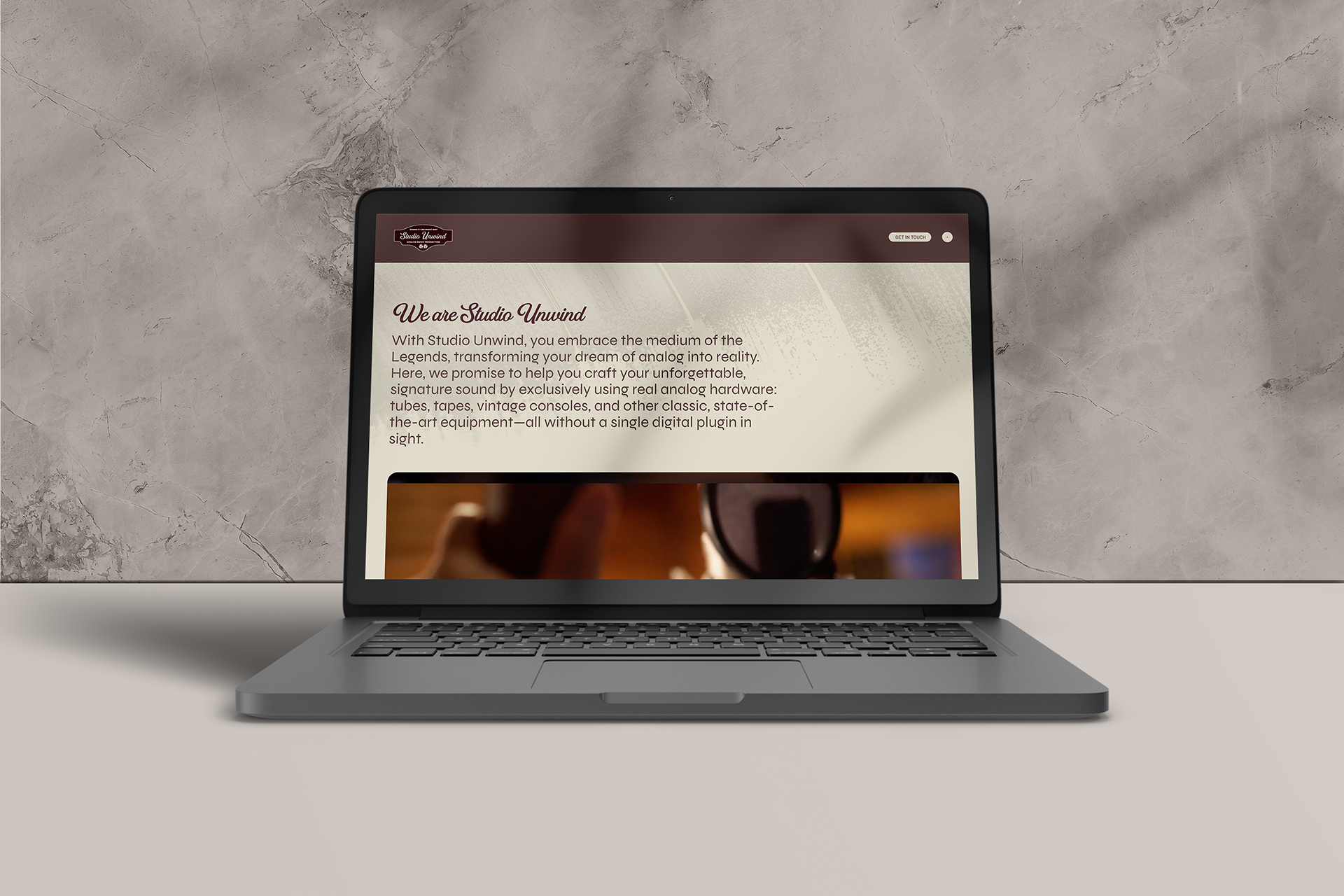
- Website Strategy & Design
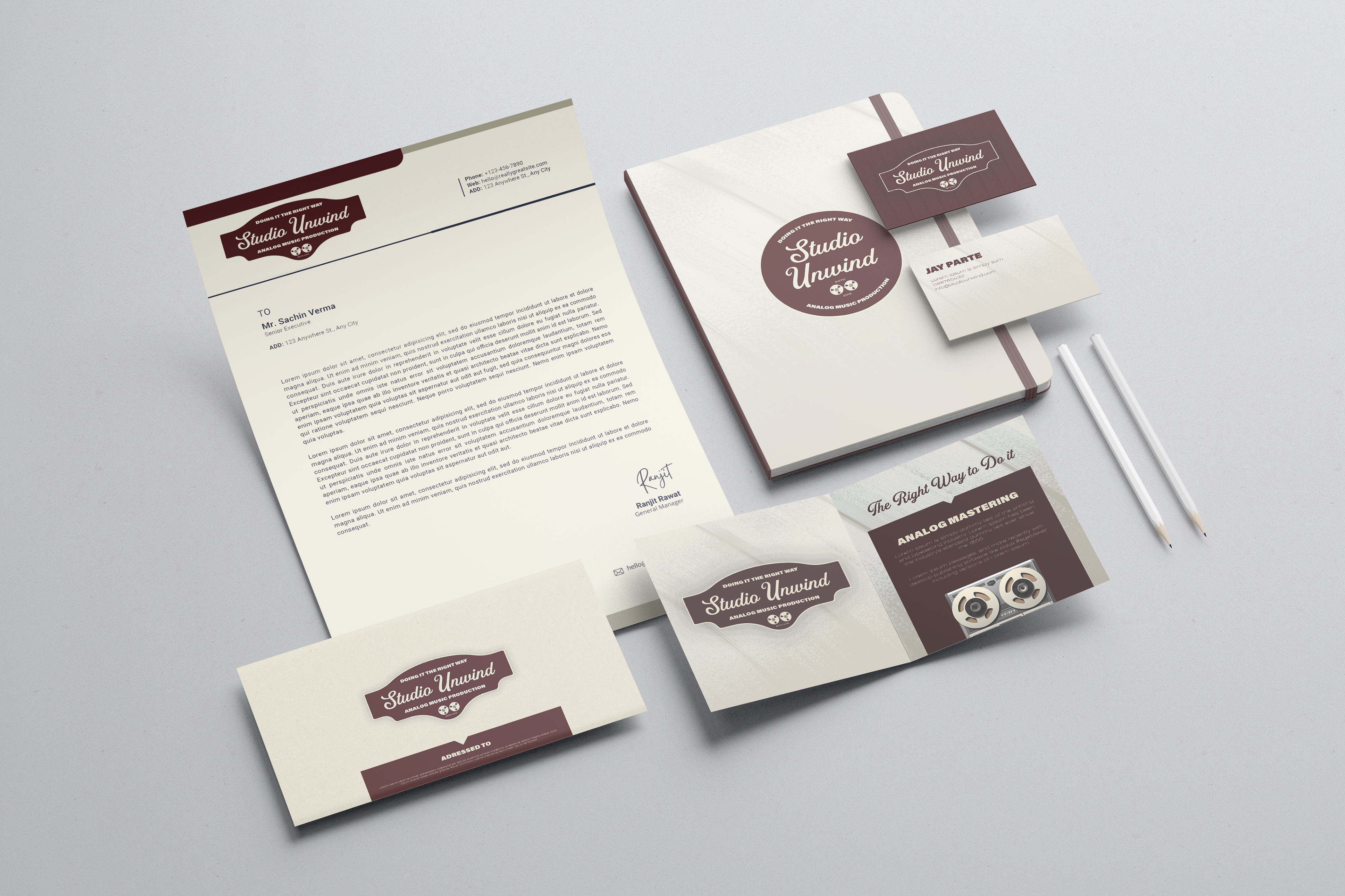
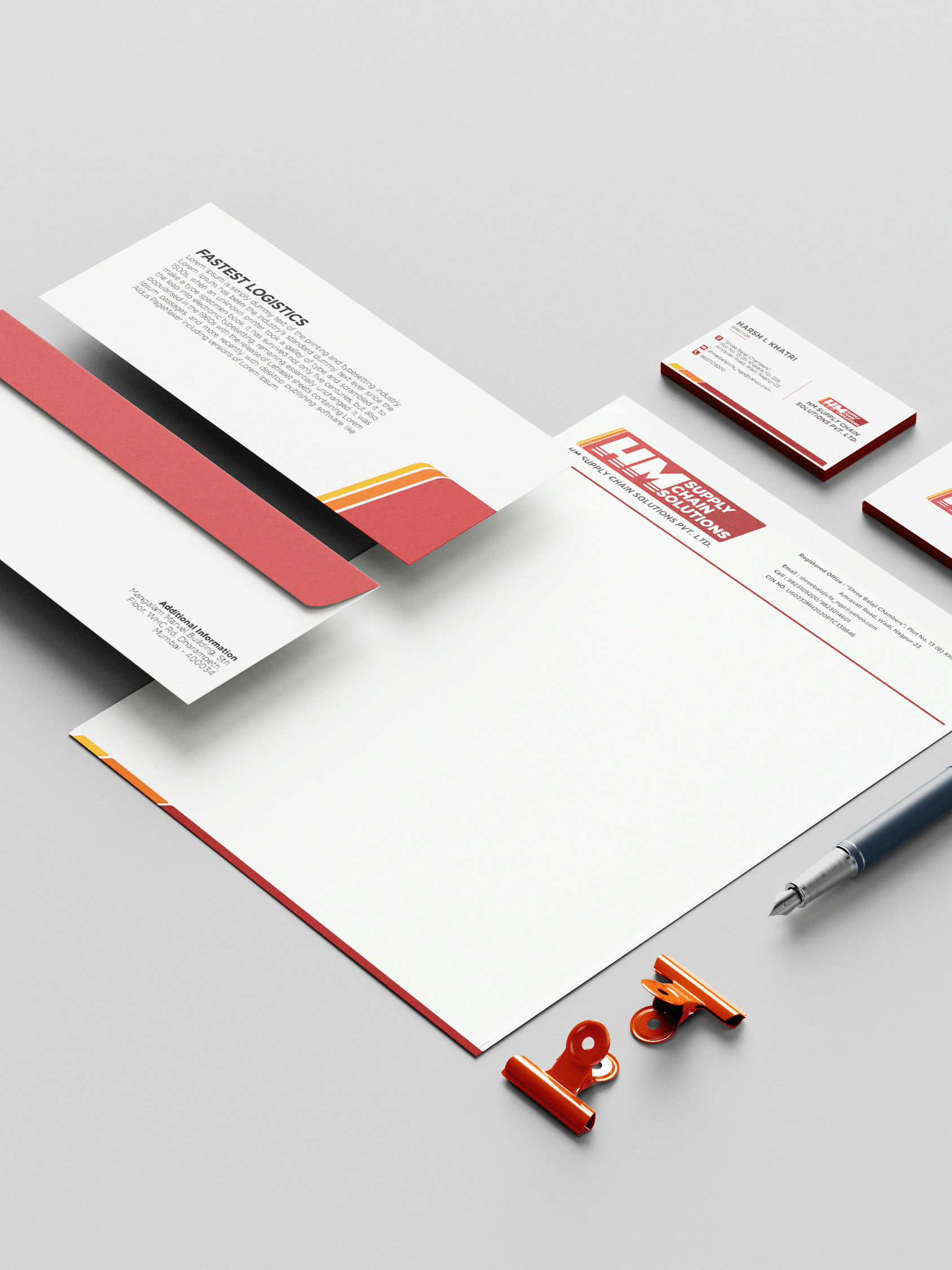
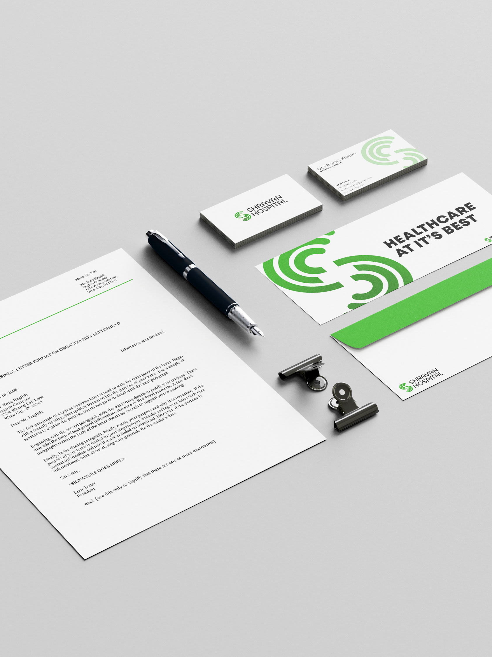
This is the entire brand identity for Studio Unwind which outlays all the printables
Logo Animation for Studio Unwind to be used for Social Media
CONCLUSION
At The Flo Studio, we partner with developers to build real estate brands that do more than market projects — they elevate them. Our work is focused on increasing perceived value, accelerating demand, and positioning developments to compete at a higher tier within the market.
For collaborations and project inquiries:
hello@theflostudio.com
For collaborations and project inquiries:
hello@theflostudio.com